
Shopify: Categorizing Actions
Challenge: Improve user understanding and navigation on a page with unclear distinctions between different types of actions
Solution: Introduce new categories to clearly define the purpose of the actions, thus improving user comprehension
My impact: Highlighted the need to improve category taxonomy, led category redesign proposal effort through internal research and user testing, and shared proposal with UX team

The original more actions screen vs. one of my prototypes
Context
The more actions menu was originally designed to hold cart-related and checkout-related actions that didn’t have room to be included in the actual cart. There were two sections:
Cart modifiers contained actions that modified the contents of attributes of your cart (e.g., adding a custom sale or customer information).
Cart contained actions that affected the whole cart, such as checkout, which usually redirected users out of the cart.
Register only contained “open drawer”—we didn’t feel that this fit any of the other sections.
Most of the actions in more actions are also available as smart grid tiles (main buttons on the home screen). Ideally, merchants are putting their most used or most important actions in the smart grid, whereas more actions is only a place to go for less frequently used actions. However, the lack of clarity in its structure created usability challenges.

Side-by-side of the more actions screen and smart grid screen
The problem

The addition of “automatic discounts”
We added a new action—automatic discounts. This prompted a reevaluation of the more actions menu as a whole. A few issues came up:
Unclear structure
There is no longer a clear distinction between what should go in cart modifiers vs. cart.
Unhelpful language
Cart modifiers and cart are very similar, and don’t explain what should be in which section.
Long sections
With the addition of automatic discounts, cart modifiers would have more items. This list is becoming hard to scan.
No scalability
There is not much room for this list to grow, and it’s unclear what new actions would or would not fit in this area.
Potential solutions
Keep the same general structure, but see if we can make small tweaks to the language
Reorganize the structure, keeping the visual design the same (e.g. create new sections)
Reorganize the structure, considering a new visual design or patterns
The initial solution
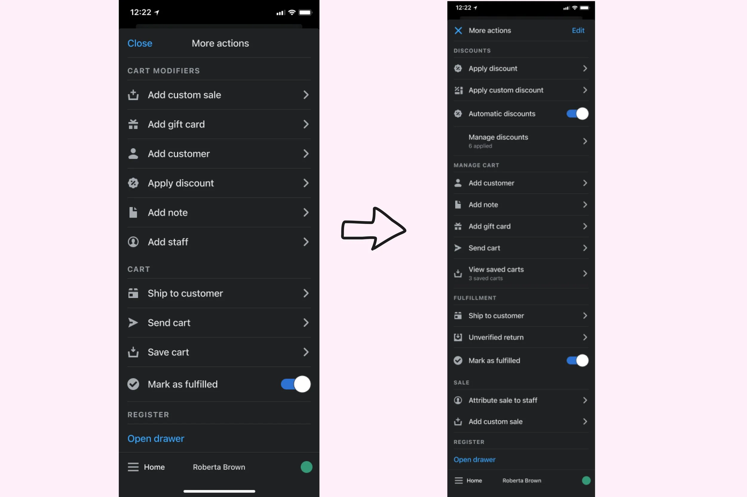

Categories and items organized based on user behavior data
i.e. “Add discount” was placed in a new Discounts category at the top, as user behavior data showed it was the most frequently used action.
i.e. “Add note” was placed under “add customer”, but above “add gift card”, reflecting its relative usage frequency.
New categories clearly define the purpose of the actions
With more categories, the list is organized, making it more scannable. Merchants will have an easier time finding what they need.
User testing was conducted on UserZoom via card sorting.
Participants were given potential category names along with the option to name categories themselves. They were then asked to sort the actions into whichever categories they deemed fit.
Participants who completed the task correctly often grouped actions into categories like Manage Cart and Discounts, validating these choices.
However, the task was difficult for some participants—several left categories blank or miscategorized actions, suggesting that clear labeling and hierarchy were critical.
Complications
Although the categories improved organization, the addition of category names made the page appear more cluttered. I had to think beyond simply categorizing the actions to design a user-friendly, decluttered flow.
Three solutions

Three prototypes with clear categorization for reduced clutter and improved navigation
Try clicking through the prototypes below!
Disclaimer: The creation of the Figma components to reflect my ideas was assisted by my mentor and a talented product designer on my team. However, creating the rest of the screens and the prototypes was my own work.
Flow 1: Nested components
Pros: This simplifies the page by only showing category titles initially, significantly improving clutter. This reduces the time spent scrolling and searching for the desired actions.
Cons: Users unfamiliar with the structure may have to click through multiple layers to find what they need.
Flow 2: Segmented control
Pros: Reduces clutter while allowing users to see actions from the selected category immediately. “Open drawer” remains persistent in the top right corner for easy access throughout the flow.
Cons: One category—”Fulfillment”—isn’t visible on the segment bar due to space limitations. Users may not realize they need to scroll to find it.
Flow 3: Expandable/collapsible components
Pros: Reduces clutter while letting users expand multiple categories to see several actions at once.
Cons: Raises questions about default behavior—should categories be collapsed by default? Should one be expanded by default? And if a user expands/collapses a section, should they remain that way? Depending on the approach, it might not feel very different from the original design.
Final verdict
When I presented these prototypes to the UX team, Flow 2 emerged as the favorite due to its balance between reducing clutter and keeping actions accessible. While there were questions about scalability and user familiarity, this flow required fewer clicks than others and kept core actions visible without overwhelming the user.